Showing posts with label review. Show all posts

Saturday, June 29, 2013

More Adventures in Nail Polish

Hello again. I've been painting my nails like crazy in the past few months, and in the past week it's gotten even more frequent -- I've had three different manicures on my claws in the past seven days alone! One could say this is getting a little... out of hand *snort* but I like changing it up pretty often, and with having to do dishes by hand the polish usually starts to chip after a few days anyways (and usually because I'm lazy with reapplying my top coat). So I thought I would share some of the manicures I've done lately, as well as some practice sessions that didn't quite work out the first time I tried them.

Neon Pink French Mani

This one was a favourite just because it was so easy and turned out so well the first time I tried it. For the white tips I finally got a Sally Hansen nail pen, specifically made for making white tips for French manicures. I can't seem to find the pen itself at the moment, so I can't show you what it looks like, but you could find it at any drugstore in the nail section for around $5. I found it super easy to use, although it took two coats to get a nice solid white line. The pink colour I used was Avery from Julep. The colour swatches on the website make it look more like a creamy pink, which is odd, because in real life it's pretty dang neon. On first try it was pretty translucent, which was a bit disappointing at first, but then I learned you have to put neon colours over a white base to make them really pop. But this translucency made it perfect for a French manicure as it let the white tips show through just the right amount.

Yellow & Green Half-Moon & Experimental Abstract Designs

Sorry it's so blurry. I had to use the timer function on my phone while holding it between my legs. SKILLS.
I was so excited for these colours from Julep because I think they look fantastic together and really pop when they're put right next to each other on the nail. These two were from the June Boho Glam set. They are Lexie, a bright opaque lemon yellow, and Dianna, a soft creamy green that almost borders on seafoam. Each one offers great coverage and could really only be done in a single coat if you wanted to, but I like to do two especially with yellow as it can sometimes have thin spots that show through. I love the idea of using these colours together in a half-moon mani, however I haven't quite perfected the use of those little round stickers. It's hard to get the placement exactly centered and the same on each nail, and I find they pull up the polish as I remove them which is frustrating. So I only did it on one hand and experimented with tape lines on the other. I had the same issue, but thought of using a striper brush to go over the lines where the colours meet. The white looked good, and I wanted to make a super thin black line over top using these tiny nail art pens I have but for some reason my black was clogged. Argh. So I had to use another striper, which was too thick, and so it kind of got messed up. But I will definitely be trying again, since these colours are perfect for summer. Onwards!

Galaxy Nails

Oooooh STARZ

I had been wanting to try these for EVER but I had lost my makeup sponges in the black hole that's under my bathroom sink. I finally found them the other day and promptly thought GALAXY NAILS YESSSSS. I had to use a whole bunch of colours for this one:

Galaxy friends.
The colours are, from left to right: Midnight in NY  by Sally Hansen Complete Salon Manicure, Co-Bolt Blue by Sally Hansen Insta-Dri, a no-name small blue sparkle in a clear base by Art Deco, Please Me Ceam colour by M.A.C., Spit Fire by Pure Ice, and Nail Junkie by Sinful Colours Professional. I started with three coats of the sparkly black, followed by sponging on little blobs of the flat blue and pink colours in random spots on each nail. On the blue blobs I put a coating of the blue sparkles, and on and around the pink blobs I used the pink sparkles which were a little bigger and looked more like stars. Finally I put a tiny amount of the yellow-green sparkles on the sponge and just dabbed them around in random spots. I really love how they turned out, but next time I think I'll leave slightly more black areas just to give the illusion of more depth. Galaxy nails might sound like a lot of work, but they really aren't--each colour goes really quickly since you're only doing a small area of each, and you don't really have to wait as long for each of them to dry since you're not doing full coats of each. Make sense? Give it a try!

Fuschia to Pink Ombre

New fave.
This one was super easy and had a great result. I'm loving how simple the concept is and the contrasting stunning result. You could do this with any two or three colours theoretically, however lately I'm sticking to two polishes that are darker/lighter shades of the same colour. As you can see the makeup sponges leave quite a lot of polish on the sides of your fingers, but it's easy to remove since it's a really thin coat. These colours were that same pink from M.A.C. above, and  a darker pink from Suzy Shier number 14033.

Watermelon Toes

Juicy.

After finally getting myself some dotting tools, I wanted to have some fun with them. I had a green polish with a striper brush, so I instantly thought of watermelon slices! How cute for summer, right? I again used the pink M.A.C. featured above and the same Art Deco brand of striper brush. The dotting tools were only a few dollars on Amazon, and the light green colour was one from Julep which I seem to have misplaced somehow. I'll post the name of it when I find it.

So there you have it! If you have any questions about the colours or techniques I used, you can send me a shout on twitter @hannahxb

Tuesday, February 26, 2013

Product Review: Joan by Julep

Last week, while looking around the internet for various nail art / manicure blogs, I kept hearing about some brand called Julep. After visiting their website and signing up for the mailing list, I was offered a free trial box (for which I only had to pay the shipping, which was $3.99). How could I pass this up?! I went for it. And yesterday, my package arrived. Hurrah!

Yay!
Let me explain in more detail how the Maven program works. After ordering my free trial box, I decided that I would sign up to be a Maven. Basically you take a quiz to determine your style profile (of which there are 4). After that you're taken to a preview of past boxes in all the style categories, just to give you an idea of what they offer. On the 20th of each month, you're sent a preview of the box they plan on sending you. If you hate the contents, you're allowed to switch boxes entirely, or you can opt to send your box to a friend for that month, OR you can opt out of the box for that month completely. The option to change my mind was a big plus for me, since I am the most indecisive person ever (I took the style quiz three times and switched it up when I signed up). The boxes are shipped on the 27th, the same day you're charged on your credit card.

When you sign up for the Maven program, boxes are $19.99 per month with free shipping. You can pick any add-ons upon checkout starting at around $5, which isn't bad. With every box you receive, you earn points called Jules which you can redeem for free stuff. The box above is a sample box for the It Girl style profile. It contains, from the top: a silvery shimmer polish called Rebel, a teal shimmer called Marion, and a dark burgundy red with gold shimmer called Joan. All their nail polishes are "3-free" which means they're free of the three most horrible chemicals found in nearly all of the nail polishes out there, which is a huge plus. It also came with a little packet of pedicure cream, which Julep calls the best ever. I'll have to review that one later. That reminds me: not only do they offer nail products, but beauty products as well--nail conditioners, hand cream, and the like.

Here's what Joan looks like on my nails, through my phone's camera:

Pretty, no?
In real life, the colour is a bit less purple and leans more towards the dark red / burgundy part of the spectrum. Wearing it feels like it's a better and more fancy version of a dark red that you would wear if you were a classic 50s beauty, like my grandmother. The gold sparkles really give it a kick. I just love it. The polish itself goes on smoothly, and if you were really in a rush you could probably get away with a single coat. I always do two just to make sure it looks even. They are high quality polishes that really deliver on their promise of fantastic colours, and without the big 3 chemicals to boot.

All this adds up to a pretty sweet deal! I get a ton of new pretty polishes to try, for a reasonable price, which is probably equal to or less than I would spend on nail polish each month (no lie, I'm a nail polish addict these days). I highly recommend the Julep Maven program!

(If anyone reading this wants to try the Julep program, feel free to click on this referral link: http://www.julep.com/rewardsref/index/refer/id/117750/ and you can enter the unique invitation code 9066750.)

Thursday, February 21, 2013

Product Review: Sally Hansen Salon Manicure in "Midnight in NY"

Right! So here we go with another product review. Hopefully it will be the first of many. I say hopefully because I have a huge list of products that I want to review (probably over 25 at this point) but whether or not they all get reviewed is completely dependent on how lazy I am in the next few months. Ideally spring would come early and we would all get super-energized with all the sunshine and melting snow and longer days and whatnot. OFF TRACK. Anyways! If you're interested, here's what I think about this brand and colour of nail polish.

"Midnight in NY" ... sounds fancy.
 At first glance I was thrilled at this colour. I, like many girls (ie the weird girls) had had my own stint with black nail polish in late grade school/early high school. And so the thought of a black that was different, and a wee bit fancier, than the regular old black excited me. It had sparkles! And little tiny ones at that! So it seemed a bit more grown-up, refined, and just... better.

SPARKLESSSSSSSSSS
And so I was so excited to try it... until I tried it. It went on super sheer, so in order to make it an opaque black I literally had to apply about 4 coats. Annoying! (Though this seems to be a common trait throughout much of the Complete Salon Manicure line. Why?!) Not to mention it chipped and flaked only 2 days after I had applied it. And once it's on your nail, you barely see the sparkles. They should have been made a TOUCH bigger.

I've had better luck with other colours from this same line (Plum Luck is a favourite of mine; only 2 coats to awesome solid colour!) but this one just did not do it for me. And it hurts a little, because I wanted to love this colour so much. I guess I'll just have to start with a regular black base coat, and apply this over top for a bit of sparkle. 

Would I buy it again? Probably not. Would I recommend it to a friend? Yes, if she wanted something a bit fun for a night out. Otherwise a no-go. Sorry Sally.

xo B.

Sunday, July 22, 2012

Review: Motorola Droid Razr

I was recently fortunate enough to get a brand new phone. My boyfriend was offered a free product upgrade from Rogers, and there weren't any phones that he liked, and so he offered one to me. The best two phones that I could choose from were the Samsung Galaxy II and the Motorola Droid Razr. I had played around with both models in Best Buy and had been somewhat pining for the Razr as it seemed to be the sturdiest and best-looking of the Android flock: different, but not too kooky or awkward. And the fact that it had dual cores was enticing.

Nice, right?

However after using this phone for a month, I've fallen out of love with it. Let me tell you some of the reasons why.

  1. The camera software. My previous two phones were the Xperia X10 and the Xperia Arc, both made by Sony Ericsson, a company renowned for it camera-phone technology advancement. The Sony camera phones were among the first really good quality camera phones, which paved the way for the Sony cyber-shots which were almost always used in Ericsson phones. Their long legacy of camera capabilities was extended into SE's smartphone camera software design and it showed with the Xperia line. Their cameras and lenses were of stellar quality, and even if sometimes the hardware of the phone couldn't quite keep up (resulting in laggy functionality sometimes in the X10) the pictures were still good enough to give the iPhone a run for its money. Both Xperia phones I owned were great at taking pictures, and the Droid Razr falls short in comparison. The primary issue lies in the auto-focus. When the camera app opens on the Razr, it doesn't auto-focus--I have to press and hold my finger on the screen to force the lens to focus on whatever it is I want to capture. I never had to do this with the Xperia phones. Their auto-focus was powerful and effective, and I was up and snapping away in seconds. The Razr doesn't allow me to do that, and in this day and age where we all need to capture that fleeting moment with whatever we have in our pockets, it just doesn't step up to the plate. I can't tell you how many blurry photos the Razr has given me in the past month. What's more is I can't press anywhere on the screen to activate the shutter anymore like I could with SE's phones. I've been demoted from screen capture capabilities to pressing a little shutter button like the iPhone, and it feels weird and restricting. I hate it. Hate hate hate hate it. This is such a deal-breaker for me that I've decided to sell this phone and get one of the new Xperia line of phones. I love taking photos on the run and sharing them. My SE phones made that easy and enjoyable, while with the Razr it's completely the opposite, to the point where I've hardly been sharing any pictures lately because I feel like it just isn't worth it to try to dig out my crappy phone and fail at taking a picture.
  2. The battery life. Again the Razr falls short here. There is something seriously wrong with this phone when it loses 40% of its charge overnight. That's from the moment I turn off the screen and put it down while I sleep, to the moment I wake up and look at it for the first time. With mobile data and wireless off, as well as background data disabled, it routinely drops from 80% to 40% which is absolutely ridiculous. Where does that 40% charge go? Does it just leak out the sides of the phone? I am not impressed. Both of my previous Xperia phones were amazing at keeping their charge during downtime, sometimes only losing 1% or 2% overnight with no use... which is how it should be. Even now, it's lost 10% in only 30 minutes--it was just fully charged and I've barely used it. I'm charging this phone twice a day and I shouldn't have to.
  3. Speaking of battery, the battery indicators on this phone only give me the battery charge level in 10% increments. It's not huge, but it is a bit odd--this is the only phone I've seen recently that does this. What's the reasoning behind this? The charge drops off so quickly that 1% increments don't even matter? Or did Motorola just want to make their horrible battery charge hemorrhaging less noticeable? That must be it.
  4. And it takes for EVER to charge, too! My Xperias could fully charge from 10% to 100% in under an hour, while it takes the Razr at least two. This is just silly.
  5. Near-impossible one-handed use. The power button is required to unlock the phone as there are no other physical buttons on the front, and it's extremely difficult to depress no matter which hand you use, and with whatever finger. It should be easier to get into your phone. Also it's just so freaking BIG. It's a wide phone. My previous SE phones were the perfect width for using one-handed. I miss pressing the middle button on the bottom of my Arc to unlock my phone. It was so much simpler.
  6. The way it looks and the UI. Maybe I was just spoiled with getting ICS on my Arc before it was officially released. It was gorgeous, beautiful, and functional. And going from ICS back down to 2.3 just feels like such a significant downgrade. I now realize for myself just how clunky and weird the Android OS on the whole looks and feels to use. I'm glad this fumbling OS is changing its tune with ICS and the upcoming Jelly Bean, because the potential for greatness has always been around, it just hasn't been realized yet. Until now.
It's not all terrible with the Razr however. There are some good points:
  1. The screen is beautiful. The brightness is off the charts and the colours look fantastic.
  2. It's fast, most of the time. Loading YouTube videos is a sinch and pretty much instant.
  3. It's durable, with Gorilla Glass for the screen and Kevlar coating the back and wrapped around the insides of the phone. My Arc's lovely thin silhouette was ultimately its downfall, as the plastic screen cracked when it was dropped a few too many times.
  4. It's pretty smart, with its Smart Actions: it suggests "rules" for you to make involving settings as attached to constraints like location, time or charge level. For example, I can set a rule that dictates that when I'm at work, my mobile data gets turned off and the sound is muted. And I can set it to send a text message to a person of my choice when I leave, which is something I always do anyways. This would work for me if I had access to a wireless network where I work, since the location-based rules can only be activated by wireless networks. This is ridiculous, as I'm not sure why they couldn't set it so that location can be detected by either wireless networks OR mobile networks via my phone's GPS capabilities. And if my days were a bit more reliable, with a steady schedule of job / class times, I could set my phone to turn data and sound off, for certain time periods like when I'm in class, and dim the screen when I'm going to bed. The best of these rules is for battery life; when it gets below 20% and it isn't charging it will go into lifesaving mode by turning off background data and other functions.

  5. And little things, like the fully-charged notification tone along with the in-pocket detection add some nice touches. Basically if the screen is unlocked, and you put the phone in your pocket it will automatically lock the screen for you if you forget. It's nice that it has a front-facing camera; we Androiders can finally take advantage of apps like Skype with free video calling. The sound that comes out of this phone is also pretty impressive, and call quality is crisp and clear. 
All in all, this is a great phone for multimedia consumption. Your movies will look fantastic and your music will sound pretty good too. Just don't forget to bring your charger with you, as well as your digital camera in case you want to take any pictures while you're on the road. This phone gets a dislike in my books, because what good are high-end specs if your battery life is crap? I can't watch a movie if my phone wants to die halfway through. The end.

UPDATE: I sold my Razr almost immediately after writing this entry and was able to get an Xperia U on the very same day. Review coming soon!

Friday, July 20, 2012

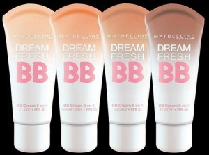
Review: Maybelline Dream Fresh BB Cream

This stuff is so great that I just had to write about it as soon as possible. A few days ago I splurged and got a little something for myself. I had recently seen some ads while flipping through Elle magazine for a couple of new makeup products labeling themselves as "BB cream." "What was this mysterious new product?" I thought to myself. After comparing two ads that looked extremely similar, claiming mostly the same benefits, I decided to try them out next time I got the chance. I imagined them as translucent, colour-free balms such as Benefit's the PoreFessional pore minimizing balm. Luckily my local Shoppers Drug Mart carried both of these products and had testers out for both as well, and I discovered that I was wrong. One was the Maybelline Dream Fresh BB cream, the other was Marcelle's BB Cream. I put one of the products on one half of my face, and another on the other side, and the difference was immediately clear--Marcelle's was heavier and more obvious-looking, and also looked darker (which is a problem when you're already testing the lightest shade they have.) Maybelline was the clear winner, and let me tell you why.


The product itself is more or less a tinted moisturizer. This kind of thing is appealing to me because 90% of the time I dislike the look of regular liquid foundation; it's too obvious, looking heavy and makeup-y and far too much coverage for daily use. This type of makeup is only appropriate for very few situations and should be saved for a fancy night out, or a photoshoot, when your skin needs to look absolutely flawless as a backdrop for dramatic eyes and lips. But for more casual occasions, like heading to class or out for a meal with friends, I hate feeling over-done and too made up. I hate feeling like it looks like I'm trying too hard. I'm fortunate to have pretty good skin; save for some minor imperfections it behaves pretty well most of the time.
In the past year or so I'd been gifted a few tester tubes of Laura Mercier tinted moisturizer, and really loved the medium coverage they provided. I could put a little of it in the main areas of my face (nose, cheeks, chin) and other spots if needed. Then I would apply a bit of powder to set it all (PurMinerals, which by the way is awesome). My tester tube was on its last legs, forcing me to squeeze the living daylights out of it to get the last remaining bit, and thus I needed to find a replacement. Maybelline's Dream Fresh is that replacement. It is smooth, light, and feels fresh upon application. It blends easily and doesn't set too quickly. It proclaims itself as an "8-in-1 beauty balm" with the eight benefits listed on the back of the tube:

  1. With SPF30 helps prevent sunburn.
  2. Helps blur the look of imperfections.
  3. Creates a natural looking glow.
  4. Skin looks visibly smoother.
  5. Compliments skin-tone.
  6. Hydrates all day.
  7. Feels fresh.
  8. Oil free.
The last four of these eight benefits can pretty much be thrown away; they're basically useless, but eight is a higher number than four, and thus they are listed as benefits. It is lovely that it's oil-free, but so are most things we put on our face nowadays. The one that was a clincher for me was the SPF30. Until now, the highest SPF factor I had in my makeup bag was SPF20, and that was my Laura Mercier tester tube of tinted moisturizer. The only facial SPF30 product I own is a daily moisturizer by Aveeno which claims to calm redness by way of deep daily hydration. This is a lie. This product is so extremely greasy that there is absolutely no way anyone could use it as a daily moisturizer. It feels just like regular sunscreen, and smells like it too. For this reason it has been living in my purse as a last-minute bit of sunscreen in case I end up in the sun for longer than I planned, or if I'm going to the beach. (Even then, it's so thick that it barely absorbs into my skin, and it usually just wipes off with the slightest amount of moisture on my face, which in the scorching summer heat is pretty common.) So I had been looking for something better. My best option seemed to be an expensive SPF serum that was upwards of $50 for a teeny tiny bottle. Until I discovered this stuff. It's fantastic and comes in I think 4 or 5 shades. It's extremely reasonable at about $15 per 30ml tube. And if you're like me, you'll only need a little dab about half the size of the tip of your finger to cover the important bits of your face. You can wear it alone or under a powder. For day or night. And even out in the sun. This stuff definitely gets my seal of approval for value and quality. It has been added to the short list of products that I buy over and over again because they're so great.

NOTE: there was no entry in the GoodGuide databases about this product at the time I wrote this article, likely since it's such a new product. I will however keep checking back occasionally and will update with new information as it becomes available.

Wednesday, May 9, 2012

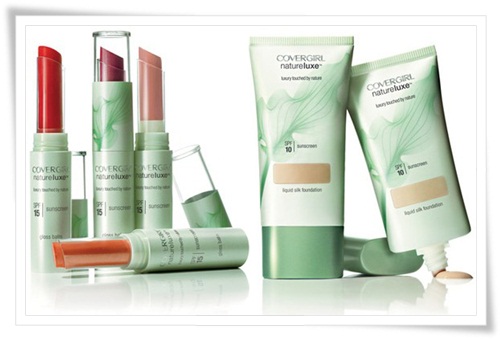
Covergirl NatureLuxe Gloss Balm

There was a time last summer when I was obsessed with tinted lip balms. I wanted to find something I could wear out of the house every day, whether I was getting fully gussied up or not, just so I didn't feel completely naked. I'm not opposed to leaving the house while wearing no makeup; however "no makeup" for me is defined as a coat of mascara and a swipe of eyeliner at the very least. So I wanted to add something to the routine that wasn't as serious as a lipstick, not as sticky as a lip gloss, and nicer-looking than just plain old lip balm, which can just leave my lips looking waxy and dull.

Enter the dreamy commercials for CoverGirl's NatureLuxe line of cosmetics, featuring lots of green, wispy scarves (included on the line's packaging!) and green, wispy songstress Taylor Swift.

Not pictured: Taylor Swift.
I'm not really a fan of T-Swift (I think her songwriting capacities are vastly overrated) but I do think she works rather well as a spokesgirl for this line. She boasted the products' "light-as-air-feel" and a lack of "heavy synthetics." She herself also happens to be fairly light and breezy, without a whole lot of... well, substance (zing!). I, being a fan of products that have a light feel, decided to give their Gloss Balm a try. It even says right on the tube: "luxury touched by nature." Who wouldn't love that?

The GoodGuide page for this product is reassuring, if you dig a little deeper and expand the ratings categories. While upon first glance, Covergirl only gets a 6.0 in the Health category, expansion reveals that this product actually gets a rating of 10 for containing no ingredients that raise a health concern. Success! A product that doesn't contain a bunch of useless junk. A hover over the little question mark next to the rating for "ingredient disclosure" reveals that since Covergirl isn't too great about including all of a product's ingredients on their labels, they cap the rating at 6.0. Still, it feels good knowing that the only questionable ingredient in this product is Octinoxate, which provides the SPF factor, and is only questionable since it has apparently been banned in Japan. This doesn't worry me, because Japan tends to allow many things that should be banned (underwear-filled vending machines top that list) and thus doesn't really influence my decision-making.

Also: a machine which vends lobsters. WTF Japan?!
On to the consumer experience. The packaging is extremely cute. Tiny and light green in colour. A satisfying click exudes as you turn the dial to extend the product. And the product itself looks nice as well. I decided on colour 215: "Hibiscus." It's a nice pink that isn't too bubble-gum and not too dusty rose, if you know what I mean. It smells delightful, and glides on smoothly with no tugging. There is no taste (which is fine; I'm not 8). It feels smooth, not slimy, and not sticky. The colour is true upon application, and there was no issue with misleading colour swatches since you can see the product right through the packaging (I have a massive beef with misleading colour samples, as I'll rant about in my next review on Burt's Bees tinted lip balm). The price point is a bit high, as one 1.9g tube will set you back $9.49 at Shoppers Drug Mart. However I did find that it lasted me about 3 months, even with regular (almost obsessive) use. If the price is a deal-breaker for you, it is available at a discount through Amazon.com at about $5.99 (and even down to $3 if you're willing to gamble on third-party sellers).

The balm is a bit thin, which is great for a weightless feel, but wouldn't hold up on my lips after having a single drink or a smooch. The solution to this problem of unreliable colour is lipliner. This stuff used to be something I only wore in one colour: red. It was for use on a single occasion: to be paired with my getting-seriously-gussied-up red lipstick. But since I just love the colour of this gloss balm, and how it smells, and feels, and the fact that it has an SPF factor of 15 (gotta protect these babies!) I sometimes want this colour to last a tad longer than an hour or so. And so I have been pairing it on such occasions with Annabelle lipliner in 010 "Natural Rose" to make the dream last a little longer. Since GoodGuide doesn't seem to have any knowledge of Annabelle's cosmetics line, I can't really do a full write-up on it. But since I've decided to include it, I will mention that it goes on smoothly, doesn't tug, and is firm enough that it doesn't just squish into your lip when you try to put it on. And it's pretty long-lasting. Problem solved!

So admittedly, I've had to step up my "no makeup" routine ever-so-slightly. It now includes mascara, eyeliner, gloss balm, and sometimes lipliner. Perfect for those outings for which I don't have to make the effort to wash my hair, but still want to look decent since I'll have to be speaking with people (I don't want to terrify the occupants of my teeny-tiny town). Like trips to the grocery store. Or the post office.  Or the bank.

Hooray for looking decent! Of course, there will always be days on which I really don't care, and will walk out of the house with absolutely nothing on my face. But those days are gradually decreasing as I continue to realize that most of the time, I like being a girl, and it's fun to play with colour and actually use all these products I continue to buy compulsively. Hopefully this gives you a better picture of this product and whether or not it's right for you. Happy shopping!

Tuesday, May 8, 2012

Product Reviews with GoodGuide


In the past few years I've started to pay more attention to the brands of products that I purchase. This includes the company's dedication to sustainability through its ingredients list and packaging, product testing methods, and its manufacturing processes. Luckily, I've found a handy website that's concerned about all of these things and more. It's called GoodGuide. I plan on including some product reviews in this blog, and with each review I'll state the product's GoodGuide rating--so I figured it would be good of me to provide a little more information about this system*.

It offers a ratings method that spits out a numerical value between 0 and 10 (10 being the best). This number is an average of three composite scores in the areas of Health (related to the product's ingredients and their direct impact on you, the consumer), Environment (reflecting the company's commitment to biodiversity policies) and Society (focusing on the social impacts associated with the manufacture of a product). Their ratings system is broken down in extensive detail here. You can shop by category (personal care, food, pets, electronics, etc) or brand, and when you're viewing the rating for a particular product, it will suggest similar products and show you their rating as well. You can even install a toolbar to accompany you while shopping online. And what's more, they've even created a handy little smartphone app to use while you're in the store, debating over which product you should buy (and which company you should support with your money). Just scan the barcode and you're brought to the product's ratings page. Neat huh?

So with that said, I look forward to being able to provide reviews that are not only informative from a consumer's perspective, but also more information regarding the product's manufacturer and its practices. I also hope this inspires you to take a moment to think about what you purchase, and helps you make more informed choices in the store! Happy shopping!

*If you're looking for more information about how the website and company itself is run, you can find that on their About page, which lists its methodology and states where it gets its funding.

Friday, March 16, 2012

Xperia NXT Phones: Spec Comparisons

In the past week, we've heard quite a lot about the new Xperia lineup of phones. The S, the U, and the P (I find SUP to be a better acronym that PUS) are similar in design, but differ widely in their features. A few tech reviews have noted that it seems like Sony had a few different design teams working on these phones, as there are some similarities in the general designs of the phones, but their differences are enough that there must have been some miscommunications somewhere. In this post, I will attempt to clarify the different specifications of each of these phones and the pros and cons of each. Let's get started!


Xperia S


The big brother of the group, this phone promises to be Sony's first flagship phone under the new Ericsson-less name. The screen size is huge at 4.3" which is only slightly bigger than my Arc at 4.2" ... which could be a problem for some. A few people have told me my phone is difficult to handle. I'm used to it, and I don't mind the size, but it could be a deal-breaker for some who are tired of phones just getting bigger and bigger. However, for those obsessed with the newest technology and the highest specs, this phone is probably your latest wet dream. It has a resolution of 1280 x 720 and the highest pixel density of any other phone out there at 342 PPI (versus the iPhone 4S' measly 326 PPI). It has a 1.3MP front camera for video calls, and a 12MP rear camera for awesome photos. The storage capacity is enormous, at 32GB (more like 25GB after formatting and installations) and running it all at stupidly high speeds is its 1.5GHz dual-core MSM8260 processor. Did you hear me? Dual cores. That means two. My inner tech geek is drooling so hard.
There are two things stopping me from committing to buying this phone immediately. The first is that the lightbar design feature running through the bottom of the phone isn't exactly... functional. Sure, it lights up when you get a call or a message when the phone is on silent, but it doesn't actually house any buttons. It contains markers for capacitive directly above the lightbar but below the screen. It's not that I have a problem with making those things function (I used to love the capacitive touch buttons on my LG Chocolate) I just wish the buttons were actually on the bar. I feel like they cheated a little. I also want the bar to light up with other colours besides white. Also, I probably couldn't gather enough money to fill a fistful to throw at Sony for this phone. Bummer.


Xperia U
By far the funkiest of the bunch is the super-cute Xperia U. It's smaller and customizable, with extra "caps" you can put on the bottom of the phone (detaches below the lightbar). White phones will come with white and yellow caps, while black will come with black and pink. So awesome, right? Another bonus is that the lightbar on the U actually does what it should on these phones. The lightbar changes colour depending on what's on the screen! For current Xperia users, think of how the colour of the trackbar on the music player widget changes depending on the wallpaper of your phone. Like this!


Pink and blue background = pink trackbar.

And green = green! Awesome.


I've loved this feature since it was implemented, and I'm beyond thrilled to see Sony take it a step further with the lightbar. I think it's genius. 
The specs for the U are slightly less impressive, putting this phone into the average smartphone bracket. Think the Xperia Mini or Mini Pro in terms of the league it's in. It still has a 1GHz processor, which is pretty good. But the screen resolution is 480 x 854, and the screen's pixel density is a lowly 280 PPI. Furthermore, its camera is only 5MP, it has 8GB of non-removable storage, and it will only record video in 720p. That being said, this phone is probably my number-one choice out of the whole lineup. I'm well aware that it would be a step down from my Arc in almost every category (resolution, camera power, storage capacity, etc) however I'm willing to forego the impressive specs of the S if it means I get that funky lightbar. I clearly have my priorities straight, I know.


Xperia P


Last but not least comes the P. This is the only phone in the NXT lineup with an aluminum casing, and the only one that comes in either silver or red. If I was only concerned about build quality and looks, this would be the top contender. It has some great industrial-esque design features, like a visible screw head and a little grille over the side speaker. The lightbar only shows white light, however the buttons on the P are actually on the lightbar itself, and not above it. Its specs land somewhere in the middle of the S and the U: 1GHz processor, 4.0" screen with a 590 x 960 resolution, 8MP camera and 16GB of internal storage. But what sets this apart from the others is its WhiteMagic display: it has an extra white pixel to add to the standard RGB pixels of its cousins. From what I've read, the screen is noticeably clearer, sharper and more beautiful than most of the other phones out there. It manages to be 50% brighter than other screens while being 50% more efficient, so all that extra brightness won't drain your precious battery.


One last thing
ALL the new phones in the NXT series will have the fast-capture camera feature, meaning your phone can go from sleep to photo capture in 2 seconds without even unlocking the device. Simply hold the camera shutter button and it will instantly launch the camera function. I'm looking forward to this, since there have been a few times I've missed a good shot simply because the camera application took too long to launch. Once it's open, however, capture is extremely fast with my Arc--and I absolutely love being able to just tap my screen to take a photo. It's almost instant and I can easily get multiple shots in no time. I really hope they continue that into the NXT series.


TL;DR
Xperia S: stunning beauty and immense power, but at a high cost.
Xperia U: funky design to set it apart from the Android clones, but with average specifications.
Xperia P: lovely aluminum body and good specs, but no fancy lightbar.


I hope this adequately summarized the specifications of the NXT series for you. If you're stilly really stuck, the guys over at Xperia Blog made a handy chart to put them all side-by-side for you. Good luck deciding on only one!